PLYMOUTH BAY WINERY: ESCAPE THE GRAPE TYRANNY!

PROJECT BACKGROUND
Ten years after purchasing Plymouth Bay Winery and growing the business into a noted destination for Plymouth Massachusetts tourists, owners Michael and Pam were ready to enhance their winery’s digital presence and give the brand a more modern feel that reflected their playful personalities. Additionally, while they were unapologetically proud of Plymouth Bay Winery’s fruit-based wines and products, they were concerned that their offering was a surprise to most customers. We set out to do a complete brand and digital refresh that would help them break through the negative stigma surrounding fruit wine and allow their playful wine experience to shine.
THE RESEARCH + INSPIRATION
After conducting consumer and market research, we saw that Plymouth Bay Winery’s surprising nature was not only their greatest liability but also the source of their greatest opportunity. Their departure from the familiar world of grape-based wine for the freedom of a new world of fruit wine was bold and gave them a modern-day connection to the Pilgrims. While their customers, mostly Plymouth tourists, were unsure of fruit wine, they desperately wanted to be seen as adventurous travelers seeking unique experiences authentic to their destination. We knew that if Plymouth Bay Winery embraced their fruitful surprise with playful confidence, they could evoke a modern Pilgrim spirit within their customers that would help them see past their fruit wine prejudice.
THE BRAND
Inspired by these research findings, we created a brand identity for Plymouth Bay Winery that calls customers to “Escape the Grape Tyranny!” Using their characteristic humor and wit, Plymouth Bay Winery dares customers to do what the Pilgrims did — embrace the unknown and embark on a journey of fruitful discovery. Their new brand boldly owns rule-breaking, allowing them to proudly showcase that wine can be made from more than just grapes, that fruit should in fact be the star of this region's show and that this wine is best enjoyed a bit differently. By embracing the surprise and creating a fresh connection to Plymouth history, they spark a sense of curiosity and respect for their uncommon offering.


As the brand and all elements were developed, we intentionally balanced a playful and thought-provoking tone with a modern, sophisticated visual aesthetic to ensure the brand’s unconventional nature was never mistaken for a lack of seriousness. Design, primary brand colors and stylistic features harken to the ocean, rooting them in the historic bay region they call home and the spirit of discovery they seek to evoke. A secondary fruit-inspired color palette represents the fresh ingredients in their products. The brand voice is approachable, confident and inspires one to be open to discovery and exploration.


WEBSITE
A total website redesign and rewrite was necessary to digitally convey to the world Plymouth Bay Winery’s playfully serious character and experience. The site is currently still in development, but the intended finished product can be seen below.


SOCIAL MEDIA
Entertaining and informative social media content pillars and templates were created so Michael and Pam can easily engage on social media in a manner consistent with their new brand look and voice. We also developed 4 months' worth of finished content to ensure a stellar reintroduction to the world!
INSTAGRAM REELS: BRAND LAUNCH TEASERS
To tease the launch of the new brand, we created a series of simple Instagram Reels that hinted at what was to come. The visuals of the ocean in the background are a nod to the Pilgrim’s daring voyage to Plymouth. The ambient sounds of waves hypnotically capture the viewer’s attention.

INSTAGRAM REELS: BRAND PERSONALITY SNEAK PEAK
For the brand’s social media launch, we created entertaining reels with pithy, witty headlines that would give the audience a taste of Plymouth Bay Winery’s new playful confidence.

INSTAGRAM REELS: PLAYFUL COCKTAIL RECIPES
The foundation of the brand is exploration and discovery, and this needed to be evident in their social media content. This cocktail recipe series dares customers to be experimental and enjoy their wine in new, non-traditional ways.

INSTAGRAM CAROUSELS
To showcase their fruit wine authority, we created a series of carousel posts that divulge unknown facts about fruits important to their region and their wine.


INSTAGRAM POSTS
Quotes from Michael and Pam were used to create a series of posts that spotlight their personal feelings about wine.


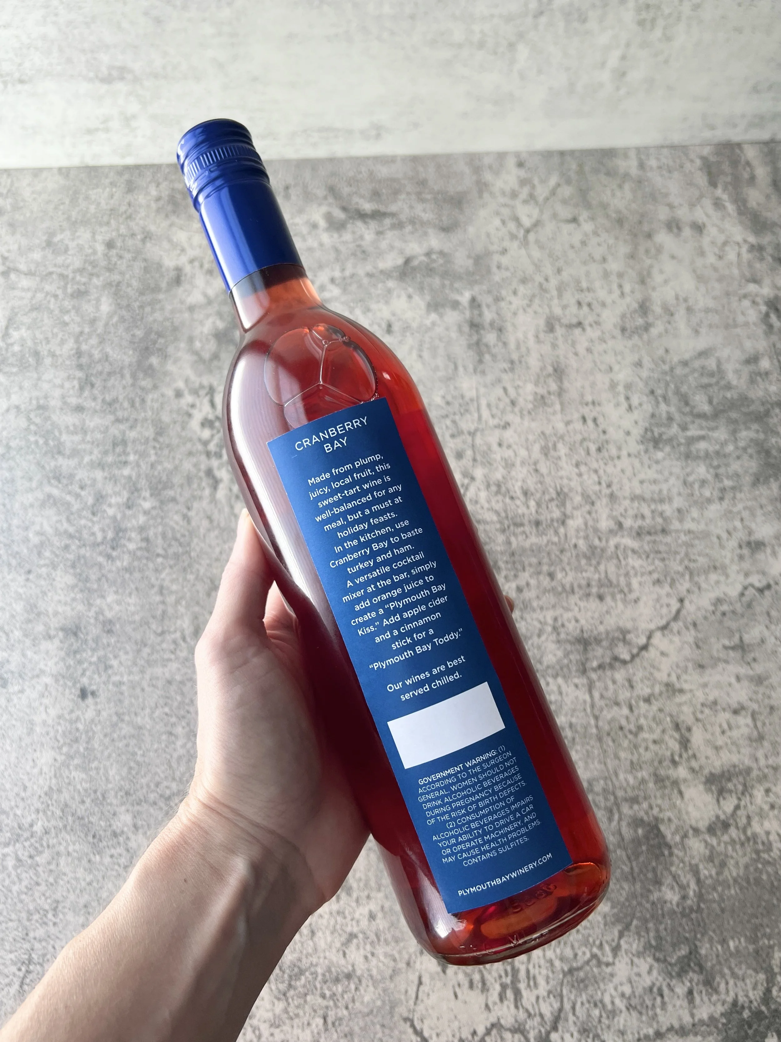
WINE LABELS
The brand look was applied to the label designs for their wine bottles. While one concept was intended to be experienced in the round, symbolic of taking a journey, the second was created to be more practical for application, while remaining minimal, modern and fresh. Each flavor was assigned its own color for the “tab,” creating a beautiful array of tones on their tasting room shelves.
LABEL CONCEPT 1: THE JOURNEY


LABEL CONCEPT 2: PRACTICAL + MINIMAL + MODERN + FRESH